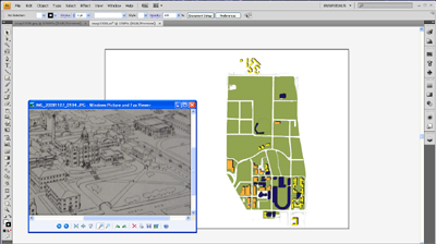
Phase II: Illustrator
The next phase was to take the data I had collected and translate it into a series of maps in Illustrator. Due to time constraints and the limited number of library archive maps from earlier decades, I thought it best to construct one Illustrator map per decade, specifically, what the campus looked like during the beginning of that decade.
I started with an Illustrator-formatted copy of the current Georgia Tech map that another student was kind enough to send me, and I proceeded to work backward. For each decade, I made a copy of the map from the previous decade and, following the photographs of the archive maps, deleted the buildings and greenspace that didn't exist yet. In a few cases, I added buildings and roads that had been torn down in later years.
For some of the earlier decades, I had to combine data from several archive maps to approximate what campus looked like at the beginning of that decade. To create the map for 1910, for instance, I used maps from 1907 and 1916, the closest years that the library archives had available.
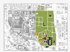
Toward the end of this phase, I realized that while I had successfully created my maps, I hadn't put them in any sort of context. To this end, I went back and placed a grayscale copy of the current Georgia Tech map under each decade map, giving the user a better idea of how the campus looked each decade compared to how it looked now. This made the contrast in the campus' size more striking, especially in the earlier decades when Georgia Tech occupied only a small fraction of its current property.

