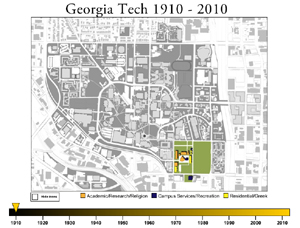
 Welcome to the documentation project for LCC 6311: Fall 2008 at Georgia Tech. This site provides a comprehensive overview of the technical and critical process for the construction of a map that traces the growth of the Georgia Tech campus from 1910 to 2010. The map, accessible via the "Final Design" link above, was an earlier project for this course during a unit on mapping, the image and information visualization.
Project 3: Interactive Map
The assignment given to us read as follows:
For this assignment, you will design an interactive map that depicts uncommon or unfamiliar information about a space. By this, I mean information about a space that is not readily represented on most maps of the same space. Examples of such information include pollution levels, historical events, personal stories or simply the overlooked details of a given space such as sewer grates or cracks in the pavement. The map must visually represent the space and visually display at least three object types within that space. You must also design a macro view of the space (e.g. zoom level) and a detail view (e.g. pop-up) of at least 1 of the object types.
After careful consideration, I settled on a map that would trace the geographic and architectural growth of the Georgia Tech campus over time. I realized that maps that display data about a given region over time are usually concerned with data unrelated to the region's geography, whereas geographic maps are static. Therefore, a map that combined chronological data with geographic information would reveal trends in the region's growth patterns that would not be apparent otherwise. I chose Georgia Tech because first, information on the campus was readily accessible via the library archives, and second, university campuses often undergo rapid growth in short periods of time, so the resulting map would be more dynamic. Also, since this was a Georgia Tech class, the project would have personal meaning for the other students and the professor as well as me.
Reading
This Georgia Tech historical map serves as a study on critical cartography as described in Jeremy W. Crampton and John Krygier's "An Introduction to Critical Cartography" and a reflection on objectivity as discussed in Lorraine Danton and Peter Galison's "The Image of Objectivity."
Crampton and Krygier describe a world in which cartography is slipping from the control of a powerful elite due to new technologies and is becoming more heavily used for political and social purposes. On the first point,
The ability to make a map, even a stunning interactive 3D map, is now available to anyone with a home computer and an internet connection. (12)
 The Georgia Tech map is a product of Macromedia Flash and Adobe Illustrator built primarily on a simple laptop in a college apartment. However, this simple map, as alluded to in the second point, shows a dramatic expansion of the Georgia Tech campus over the last century. Therefore, it becomes a tool to illustrate Georgia Tech's expanding influence in Atlanta and, to a lesser extent, in the nation as a whole.
Ironically, this map uses information provided by official state agencies combined in new ways to justify Georgia Tech's growing power base, juxtaposing traditional objective geographic maps with more modern artistic approaches to map-making. (This combination of information in new ways is an example of Crampton and Krygier's map hacking.) However, whether the information acquired from these traditional maps is indeed objective is itself open to scrutiny, for as Daston and Galison describe it, the notion of objectivity itself has changed over time from a focus on natural illustration to a romanticizing of the machine:
Where human self-discipline flagged, the machine would take over. Wary of human intervention between nature and representation, [French psychologist E.J.] Marey and his contemporaries turned to mechanically produced images to eliminate suspect mediation. (81)
This map, though, is a human-driven creation assembled on a machine based on data drawn at least in part from hand-illustrated maps. Does the introduction of new technologies somehow make this map more objective, or is Marey more concerned with machine-produced images taken directly from nature? Furthermore, what levels of subjectivity are added by choosing which years of each decade to represent on the map, the building classification and the choice of buildings to highlight with icons?
In short, the Georgia Tech map raises issues of objectivity while reflecting artistic and social trends common to discussions of modern cartography.